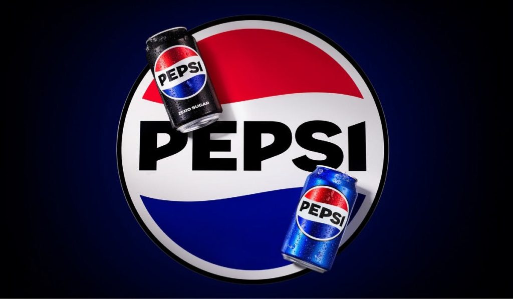
Pepsi is celebrating 125 years in business with a new logo. It’s good to keep the visual identity fresh – always a challenge with a legacy brand – but what I think is especially interesting is the language Pepsi leadership is using to describe the change.
“Unapologetic” is the word that keeps cropping up. For a while, the brand was playing with the “Is Pepsi OK?” phenomenon experienced in restaurants, but now the tone is different. Mauro Porcini, PepsiCo’s chief design officer, explained that the new logo takes everything people love about Pepsi’s past to create a bold, confident look for the future.
Classic elements of Pepsi’s identity are presented in a nostalgia-inspired red, white and blue round with a newer darker color scheme – all the surrounding black is a nod to Pepsi Zero Sugar, the current star beverage – with the logo centered in black. The font is much bolder and more aggressive than the previous version: this is a soft drink not ashamed to command your attention.
I think it will be successful. It’s never a bad time to be proud of who you are – and that’s a message Pepsi’s target market of teens and young adults understands and appreciates. But I’d love to hear your thoughts – do you like the new logo & the storytelling behind it? What would you do differently if you were in charge of this decision? Let me know!
—
With over 20 years of experience as The Cult Branding Company, we’ve honed our strategies and methods to help companies identify their brand’s DNA, gain deep consumer insights, and understand the marketplace ecosystem. We are an independent agency that creates strong and provocative relationships between good companies and their customers.
