I’ve served as an art director for the U.S. Postal Service for seven years. It’s a curious and delightful job and one that has brought me a great deal of creative fulfillment throughout my tenure. The process is quite fascinating, involving not only folks from the Postal Service but also American citizens who’ve been selected to help decide appropriate stamp subjects. Yet, as an art director, one of the most rewarding aspects of my work is developing relationships with the artists themselves.
The stamps I art direct — such as Johnny Cash or Batman — are typically assigned to me, but every now and then, I get to pitch my own ideas. There’s an open call to propose topics for ongoing series of stamps, such as those that feature the American flag or celebrate holidays or love. While there’s no shortage of creative ideas floating around my work/life atmosphere, as a designer and as president at Journey Group, it’s knowing when to capture the right idea that’s key — and then where to find the perfect collaborator.
Part I: Art directing and designing a stamp
The Love series started in 1973 with a stamp by pop artist Robert Indiana, and stamps from the series remain a favorite choice for those mailing valentines, wedding invitations or love letters. As an art director, Love stamps present an engaging creative challenge. You want to pitch something fresh and new, but the subject also needs to appeal to a broad audience — and reference the soaring emotion of love without being too saccharine or melodramatic.
As I was pondering ideas I had banked away, my colleague, Mike Ryan, creative director at Journey Group, campaigned to have Anna Bond design a stamp.
Anna Bond, for those who may not recognize her name, is the creative genius behind the wildly successful Rifle Paper Co. I first met Anna about 10 years ago when she was just beginning her design career and have kept up a long-distance friendship with her since then.
“Since I was little, it’s been my dream to design a stamp. I’ve always said that’s one of my top-five career goals.” — Anna Bond, Rifle Paper Co.
I, along with the rest of the world, love her vintage-inspired illustrations and aesthetic sensibilities. Upon hearing Mike’s suggestion, I knew she’d be the perfect illustrator for a Love stamp, and I had a hunch she would be up for the challenge. In 2015, Journey Group interviewed Anna for a feature story for the Postal Service website Beyond the Perf.
When Anna was 8 years old, she was given her grandfather’s stamp collection in a binder.
“I didn’t realize it, but looking back, it’s obvious that I was drawn to the graphic design of stamps,” she said. “Since I was little, it’s been my dream to design a stamp. I’ve always said that’s one of my top-five career goals.”
With the help of the team at Journey Group, I was excited to help make that dream come true.
The work
I struck up a conversation with Anna at a stamp show in New York, and we met for coffee to brainstorm about the future stamp. She was immediately on board, and I was delighted about the collaboration that was taking shape.
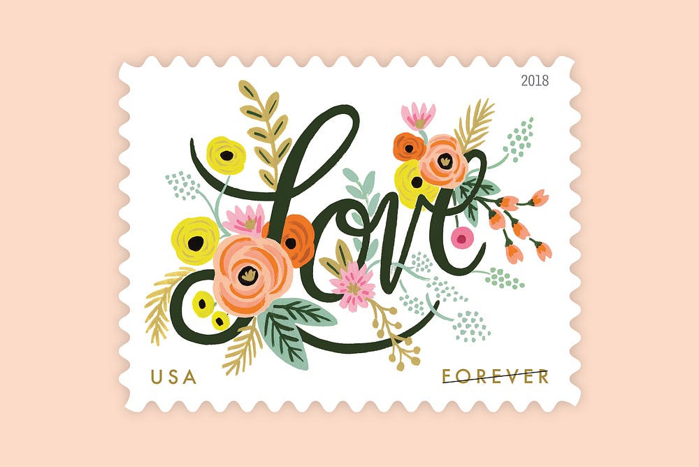
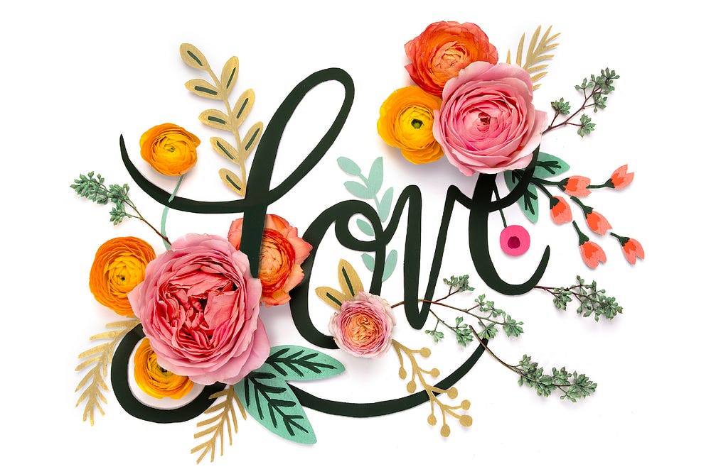
A floral design felt like both the obvious and right choice for this stamp, based on the series and on Anna’s aesthetic. I am also a sucker for hand-lettering, and I have always loved Anna’s loose, cheerful script on her stationery. We agreed that the design should be in the middle of the plate, with the word “Love” written in her script and surrounded by her signature flowers.
Anna began to work her magic, and in short order, we had two leading designs, one version on a dark green background and one on a white background. The stamp with the white background was ultimately chosen as the final design.
The result
The Love Flourishes stamp, which released on January 18, promises to be a thrilling success.
Anna and I were present for the First Day of Issue ceremony in Love, Arizona, and I was delighted to receive affirmation that Anna was the right choice. The audience was composed of many stamp collectors, as well as many fans of Anna’s work.
Part II: Translating stamp art
We were thrilled with the final stamp, and we were equally excited to extend the stamp’s success to another product that we work on at Journey Group: the Postal Service magazine USA Philatelic. For the spring 2018 issue, we knew that the Love Flourishes stamp would make a gorgeous and eye-catching cover.
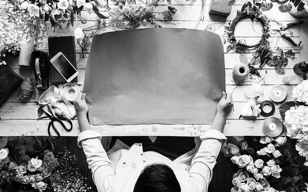
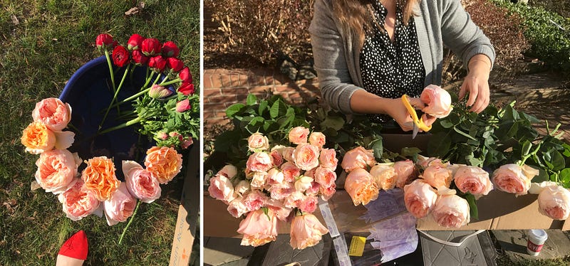
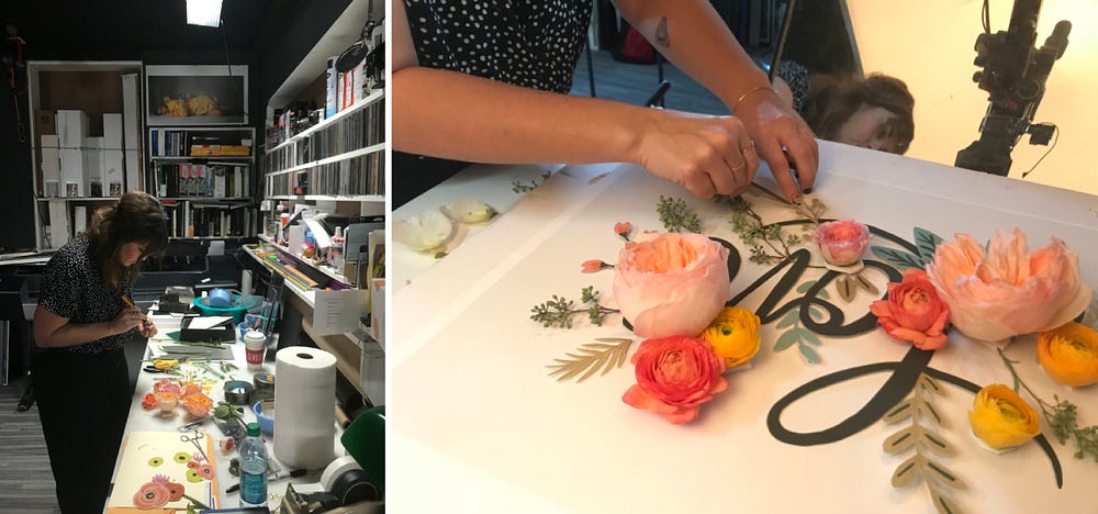
Journey Group’s art director Ashley Walton and production designer Brittany Fan were enlisted to translate the stamp art to the magazine. Inspired by the stamp artwork, Ashley wanted to make the two-dimensional design come alive by using actual flowers and paper cut-outs for the cover.
With this concept in mind, Ashley and Brittany trekked to Washington, DC, to hunt for flowers at wholesale markets. A particular challenge was finding flowers with the right color, texture and feeling that would evoke Anna’s illustration — without knowing the exact names of the seemingly countless floral varieties.
Arriving with their arms full of flowers, Ashley and Brittany worked with photographer Len Rizzi to prepare the shoot in his studio, including laying out the design with hand-cut paper shapes and type, styling the flowers and mounting them in foam core, and managing consistent shadows, despite the differing depths of the material.

The team wanted to conjure up a cover that was soft, romantic and delicate and yet would stand up well next to Anna’s original artwork.
From start to finish, we were delighted with how the partnership with Anna Bond played out. As a person who works intimately with stamps, it was a pleasure to work with someone who still loves using stamps and sending mail through the post.
“It’s so special to receive a letter in the mail these days,” Anna said. “I’m used to getting mail that I don’t want to open, so I think a letter automatically makes you feel good because you know someone put effort into it. It shows they care.”
Anna’s effort and care with this design emphasizes the key to any successful creative collaboration. As an art director, what I’ve learned is that you give someone like Anna basic parameters and boundaries, and then you let her go. That’s when it goes well. The hardest and best thing I do as an art director is select the right artist. If I do that, the work flows beautifully. Choosing Anna for this project was the right call for the right time, and I loved helping her work find its way onto a stamp.
About the Author of this Post:
For Greg Breeding, strong communication—visual or spoken—is always about clarity. A graphic designer at heart and by trade, Greg’s decidedly Swiss perspective is shaped by years designing magazines, art-directing postage stamps for the U.S. Postal Service and taking an annual pilgrimage to (where else?) Switzerland to study the craft. Since co-founding Journey Group in 1992, he’s brought strong design thinking to many client relationships, building rapport through genuine interest, well-told stories and a subtle Southern drawl.